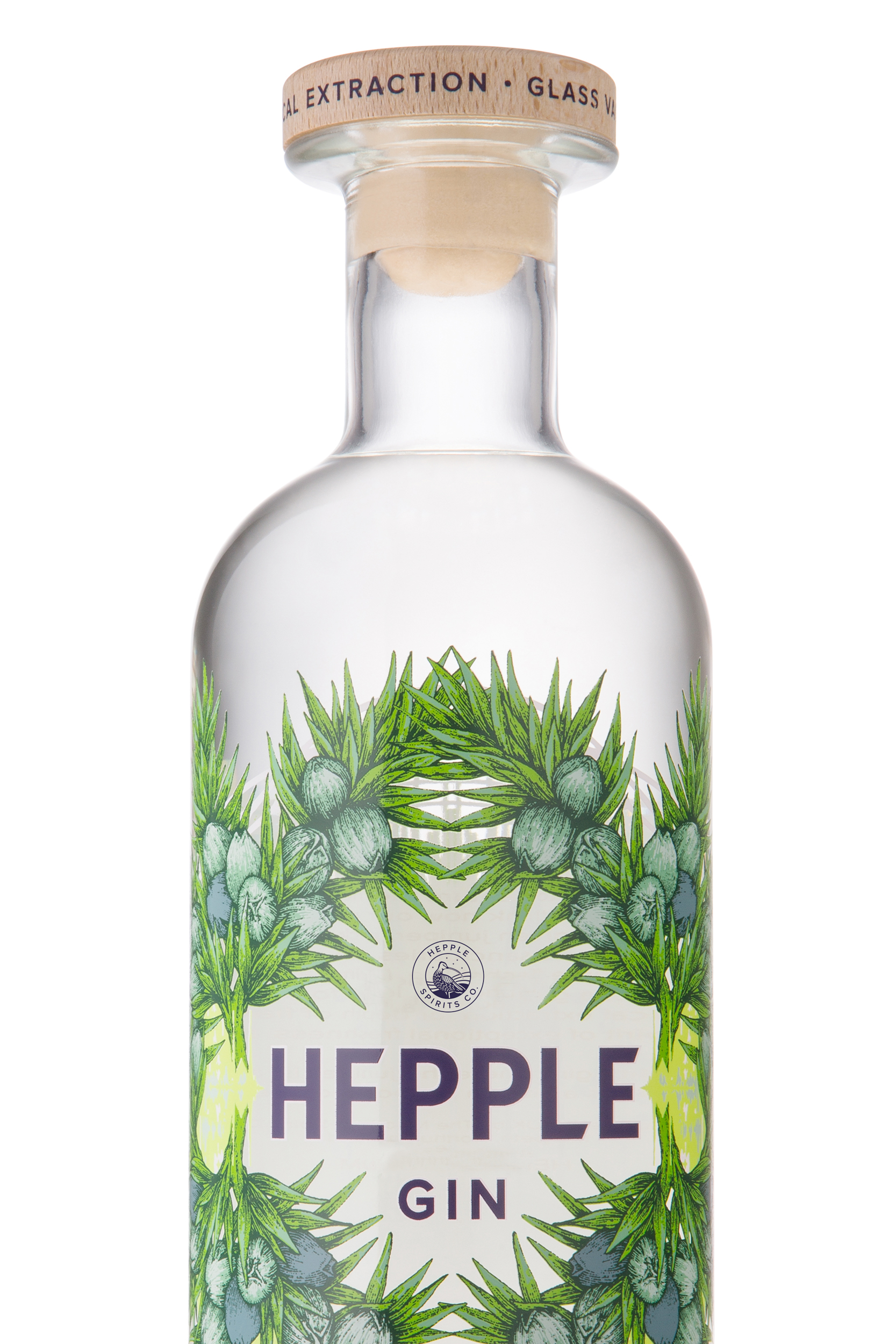
Hepple Spirits Co.
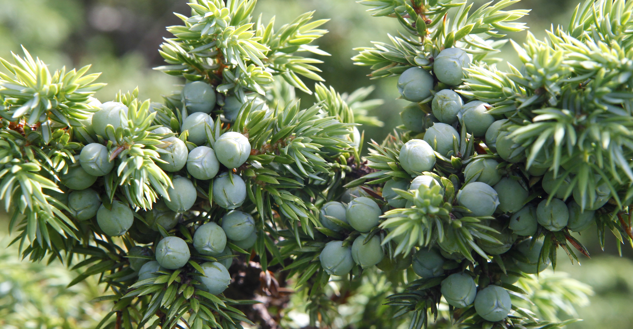
Located in the remote Northumbrian Hills, Hepple is one of the purest natural environments in Britain and as a result juniper thrives. The berries are picked and distilled in small batches on the Hepple estate by a small, dedicated and very talented team. Through respect of the natural environment, innovation and research Hepple have created one of the most celebrated gins on the market today. hepplespirits.com
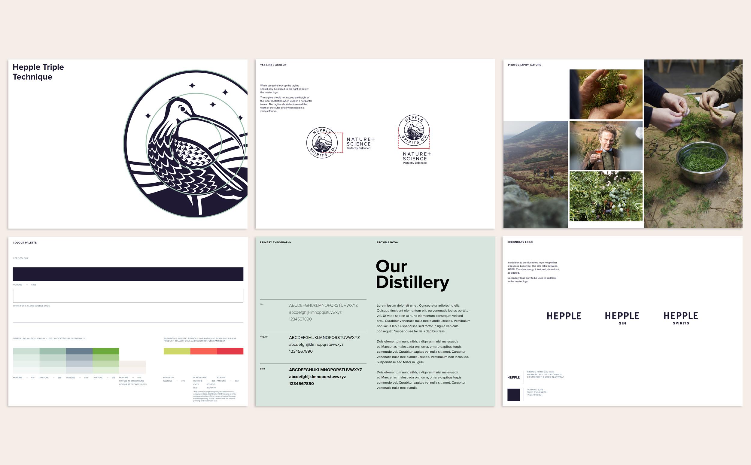
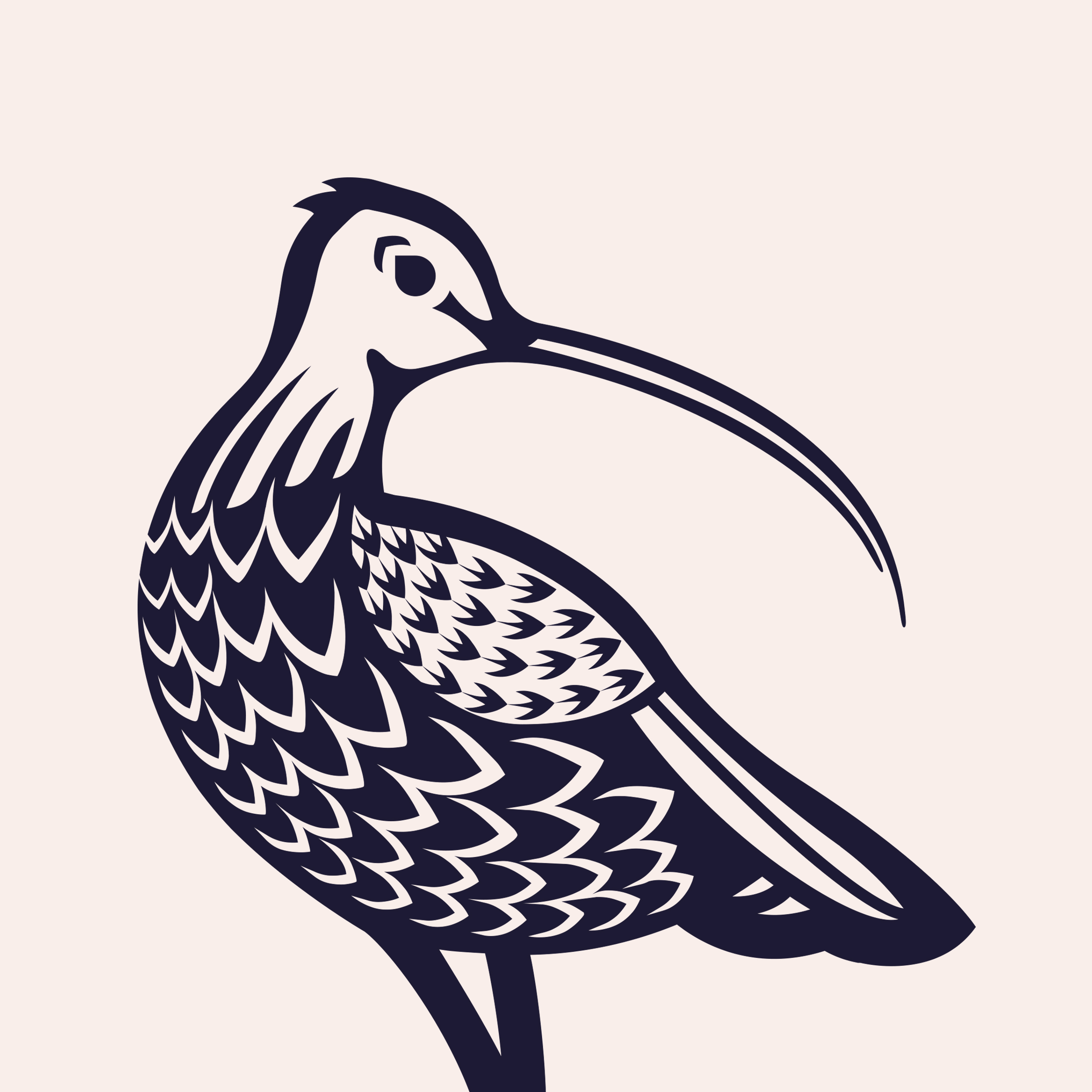
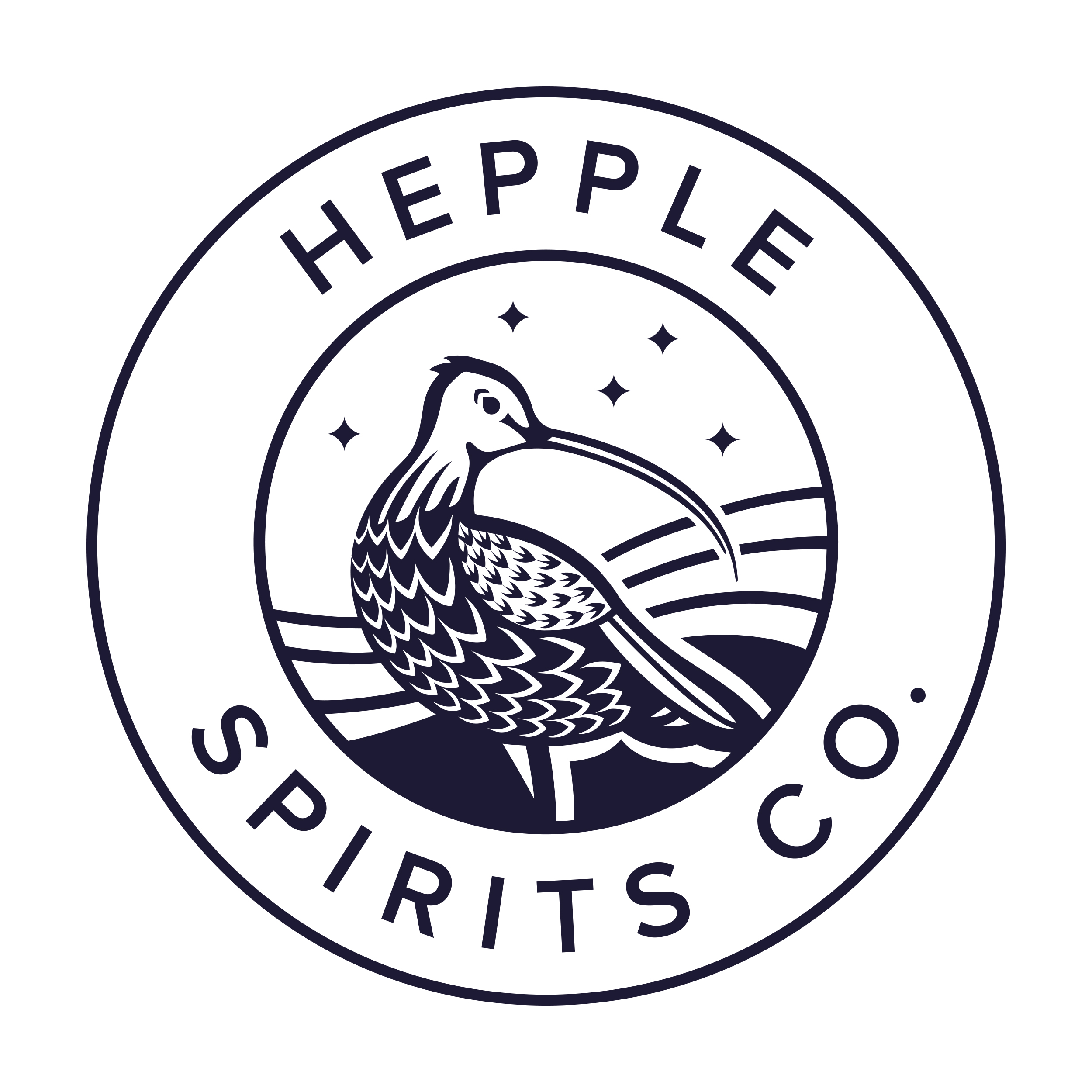
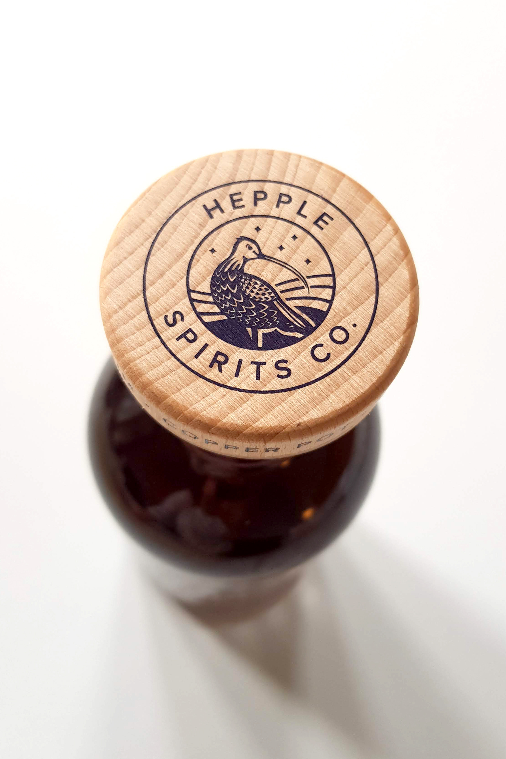
In 2018 Hepple commissioned me to create a new logo after the original illustration had run its course – becoming restrictive in its application possibilities. It was important to keep
the Curlew bird which is native to the local area and historically relevant to the
brand. This was reimagined in a more contemporary style, better reflecting
Hepple’s careful balance of science and nature. The new logo can now be applied equally
well across screen and the wide variety of print processes that the brand uses
to communicate the quality of their product. The Curlew bird is designed around
three concentric circles – a reference to Heppel’s unique triple distilling
technique.
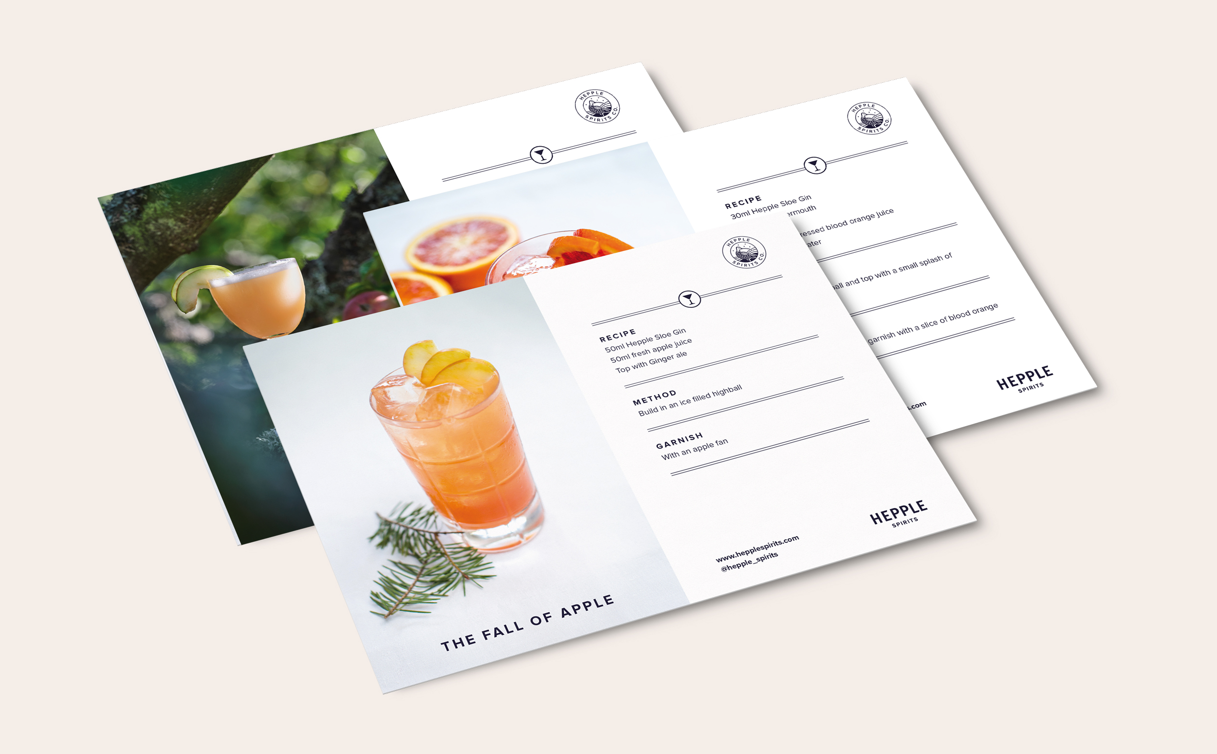
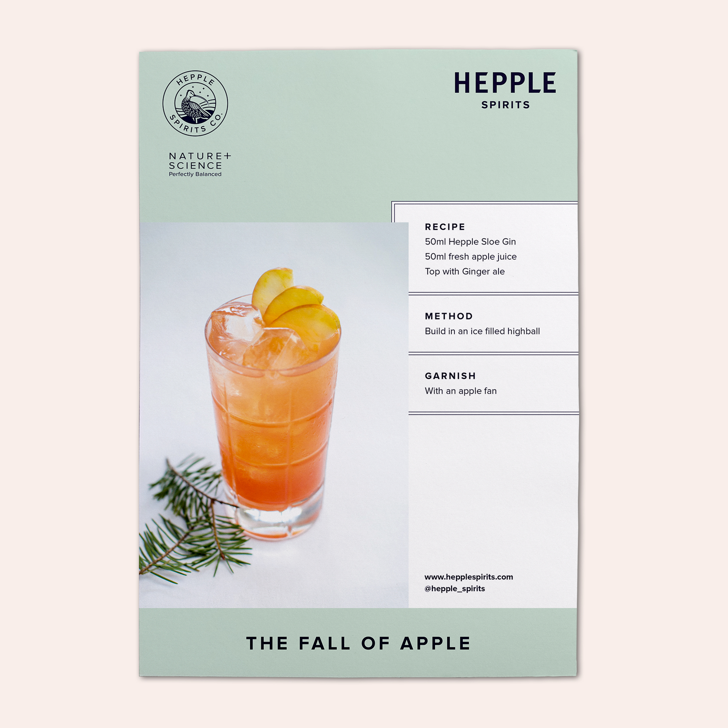
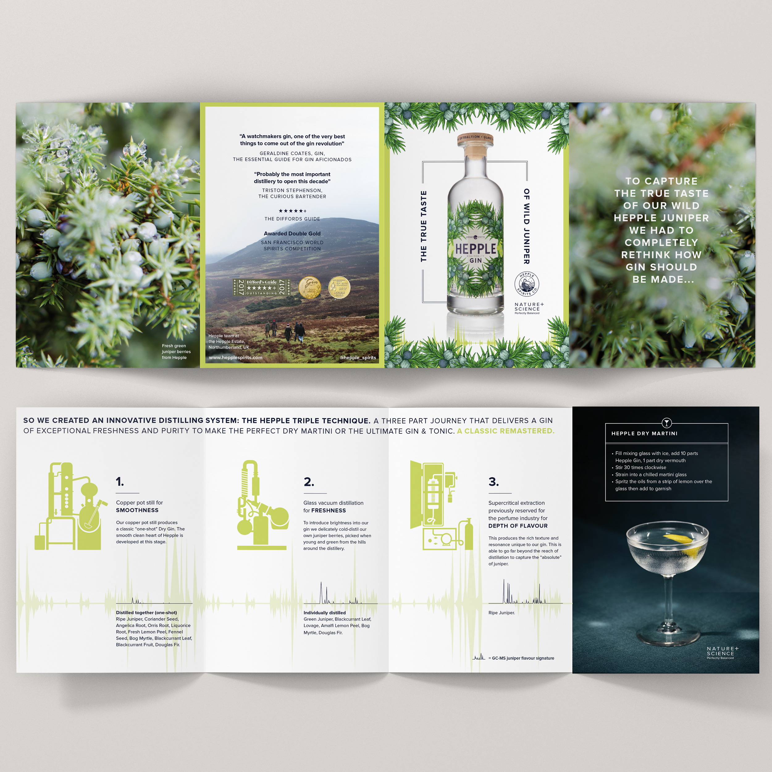
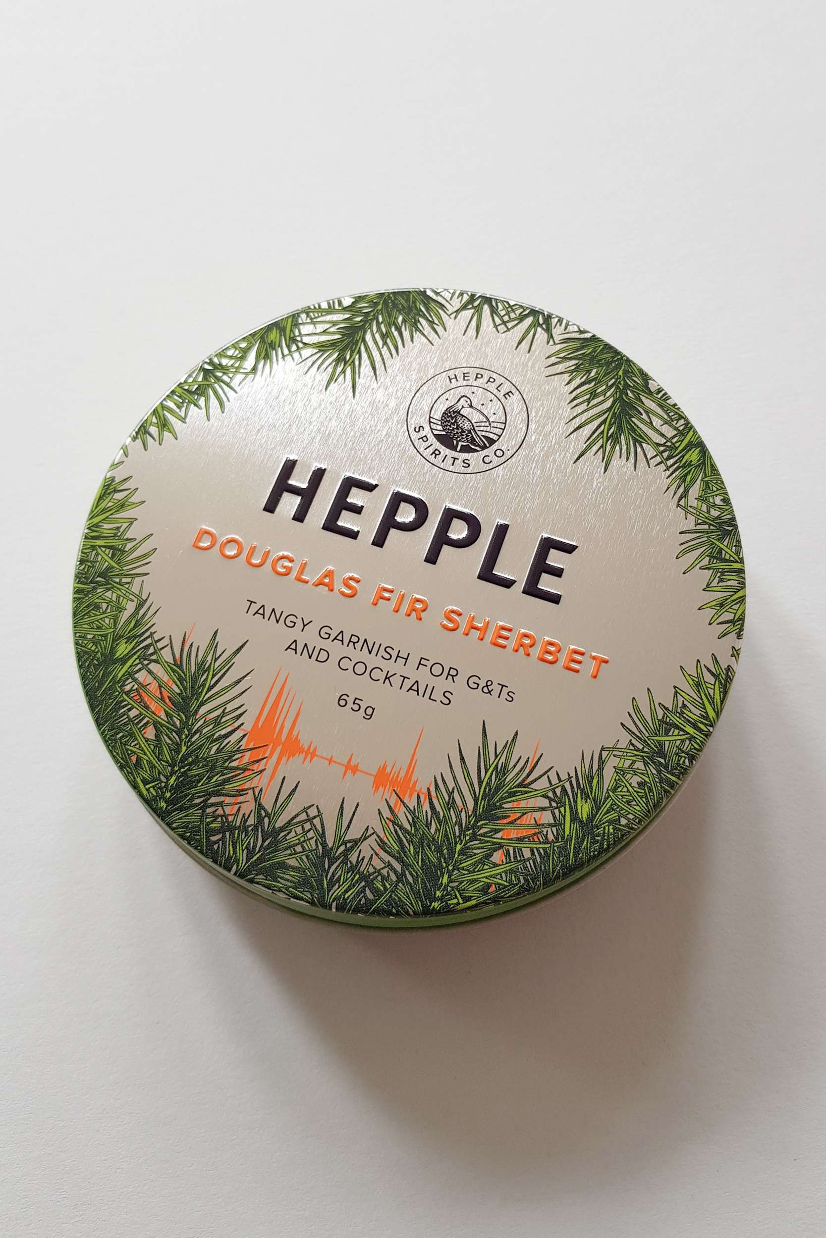
Since 2018 I have worked closely with Hepple, clarifying their brand identity, creating brand guidelines and designing packaging, stationery, information and menu cards.
Since 2018 I have worked closely with Hepple, clarifying their brand identity, creating brand guidelines and designing packaging, stationery, information and menu cards.
“It might be the best Martini gin I haver ever tasted”
Victoria Moore – The Telegraph // San Francisco Spirits Awards, 2017: Double Gold Award
Victoria Moore – The Telegraph // San Francisco Spirits Awards, 2017: Double Gold Award
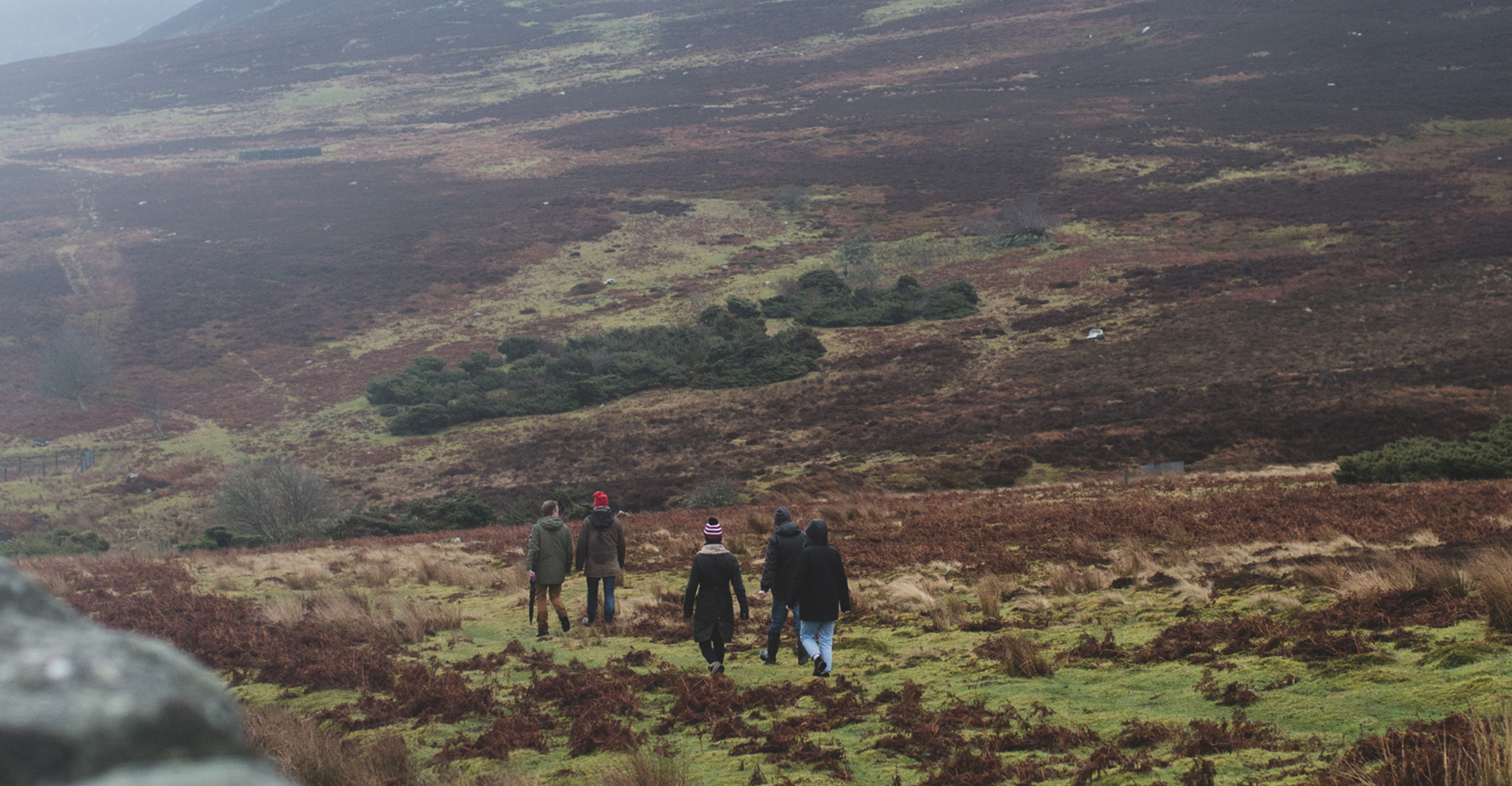
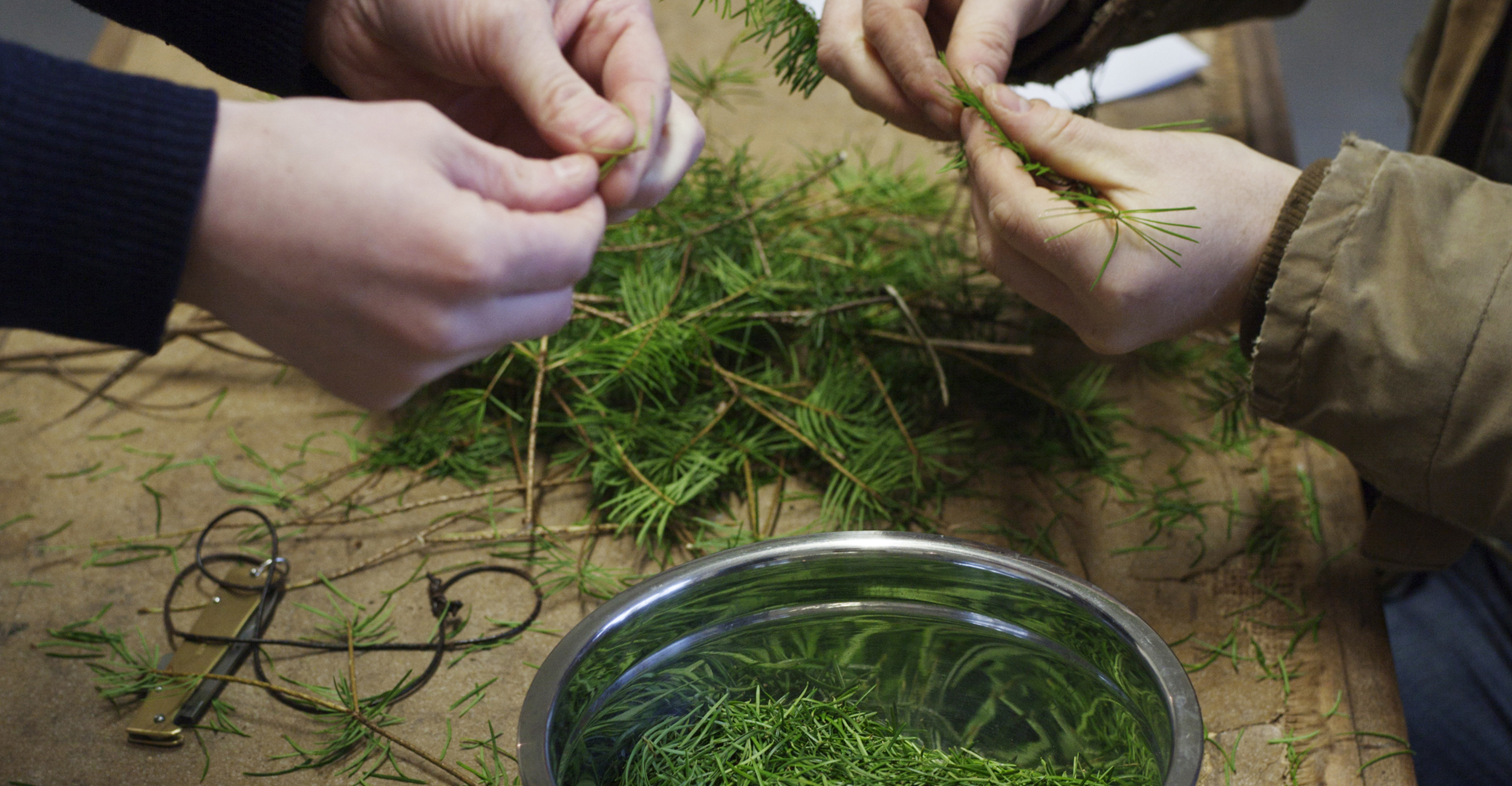
^ Hepple estate and distillery
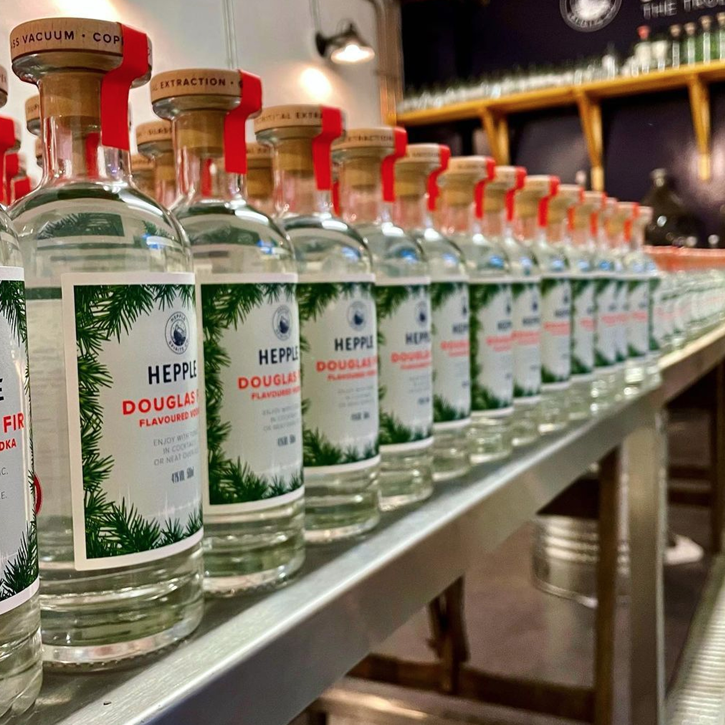
^ Design details